Planning ahead for project completion

Once my collograph prints are made next week, I need to finish development of and complete my drawings, establish the final layout of my artwork, and paint in the surface pattern layers. I’m satisfied now with my dip pen drawings and artwork and will consider whether to include my mindful poems in the border of my map. 

The next issue to resolve is how to digitally present my “Map of Mindfulness” project online in its best light. I’m going to need technical assistance in photographing it – I anticipate probable issues with screens/colours and detail of my watercolour digitally which has always been a challenge with these mediums! I have already been advised that photographs rather than scans will give much better quality, and the images will need adjusting from raw photo format in Lightroom into Photoshop, and then be saved as a ‘pdf’ file. Scanning of the images would lose definition and colour. Unfortunately, digital presentation of my artwork is the required method for submission for assessment. I am concerned that aspects of my artwork detail may not be visually presented in its true and best qualities. I need to allow adequate time for this process to get the best visual results possible. 

Bibliography

I’ve been compiling my project Harvard bibliography using Mybib,  www.mybib.com has been a wonderful (free!) online tool. (Used successfully for my Stage 2 project). I will also add a separate reference list of artworks researched as I have studied and been inspired by several artists and their practice throughout my project. (I was concerned last week when I was online adding more reference details to it, and “Mybib” website showed an error message “content unavailable at this time”. Every reference I had entered to date was not showing. Fortunately, I had downloaded the major part of my referencing to a Word document a few weeks ago. My continued research has slowed down and become more refined during the second half of the project, so even if it had been irretrievable, I would not have had much to add thankfully. It’s all available again today – and backed up. A valuable reminder not to depend on technology and to frequently back up my files!

Mid Point Review Critique

It was good to see some of my peers work and their progress. Not being on campus has been very difficult both inspirationally and socially, and of course not seeing everyone’s progress and artwork, other than in our small Zoom tutorial peer group sessions. We are all so diverse in our ideation and styles. The few times I have been to campus to collect materials I have seen a handful of other students, and we’ve had a brief opportunity to discuss our projects with each other.

My mid project review with Camilla Pugh went well, I was nervous that I’d not achieved much to evidence to date in the development of my final artwork.  However, I was pleased that I seem to be on track. I combined my ideas for the artwork layers, surface patterns and sepia pen drawings onto a small test piece of ordnance survey map, (approx 40cm x40cm), my final map will be A2 landscape size. I wanted the layers to be visible, down to the actual map background. It worked really well and came together exactly as I had visualised.

Is the subject context clear? = Context in the project is shown well with the subject matter

What are the intentions of the project? = Intentions with the nature and well-being shown well through the project.

Is there evidence of idea generation? = Idea generation, printmaking, prints of leaves, drawing, painting, broad response.

What research has been gathered? = Research is strong which has helped move the project forward. Research is relevant. Sources are cited. Research has been used to develop ideas.

Is there evidence of experimentation? = Strong evidence with hand drawn, printmaking and mixed media pieces

What evidence is there of problem solving? = Problem solving is evident through looking at materials and testing.

Has the original idea (outlines in the project proposal) changed? = No

Have changes in timetabling been noted? = Yes

Is there evidence of planning and organisation? = Yes

Is there evidence of contingency plans = Yes

Is there evidence of ongoing evaluation and reflection shaping the project? = Yes

Is there research & planning of final outcome for presentation to intended audience = Yes

Researching & Experimenting with Collographs

Following further discussion on developing my artwork in my recent tutorial on 15th April, I have decided to experiment collograph printing to see if it might be another dimension to add to my artwork.

There are so many instructional videos on You Tube and I found an inspiring one by Mael Matthews, (a senior art educator for TES), https://www.youtube.com/watch?v=Mc-ybzxIbEU. I created some A5 print plates from found items at home – aluminium foil, string and brown paper, and was fairly satisfied with the outcome, although I did think it looked quite simplistic. It was difficult to know how deep to carve into the grey board, and how much layering to build up onto the plate. The PVA glue I used was very watery, and the string and foil didn’t completely adhere to the greyboard I’d bought. I had to re-coat those sections with more glue, which became very hard when dry.

I arranged to see our Fine Art technician, Kev and met for a detailed discussion about what I wanted to achieve. He gave me helpful advice and showed me examples of abstract collograph prints and print plates. We discussed how to build up a collograph print plate, what works and what doesn’t. (The string detail from my test plate I made from the video is too hard, and it will tear the paper when printed, so I can’t use this plate in the intaglio press. Another issue is not being able to print onto my actual map background layer paper, which is hand painted, first with gesso, then with a blended wash of watercolour. I can’t print directly onto this as the paper needs to be soaked in water and has to be completely damp prior to printing. Soaking the paper would wash away my watercolour layer, which is an integral part of my map.

We discussed the possibility of creating smaller plates onto cartridge paper which could be collaged onto the map. I suggested wet-strength tissue paper, but this would also tear. The colour of the print ink will need to be fairly pale or mid-tone – I’m concerned as many collograph prints I’ve researched appear to be quite ink-heavy – does there need to be that much ink in the plate to get a good print? Test printing this will be the only way to find out. Following Kev’s knowledgeable advice I made three further print plates, using egg shells, soft thread from bandages, paper doilies, dried herbs, found paper and pressed ferns. These need to be coated with 3 layers of shellac to seal the plates, (some of the detail might lift off in the process). Kev will prepare the plates with shellac layers, and when they are fully dried I will book to use the intaglio press with his supervision next week and see how they print out. Will the egg shell become further crushed? Too small? Will the detail I added register on the prints? It will be interesting to see the outcomes of my prints next week and what works well. Perhaps I can incorporate a successful print into my final artwork ….

Ephemeral Land Art, Mindful Poetry and ‘Eco Style’ printing

In frustration, and wanting to continue developing my artwork during the Easter break, I returned to my hand-rendered layout testing, this is the way I enjoy working and feel most creative. I painted (watercolour) grey-blue swirls and waves of the surface pattern layers directly onto the sunset wash of the map background. Adding another layer over the map patterns created depth and emulates the layers of mediation process. I’ve got a new fan brush and have been practising painting the twisting “rope lines” creating pathways flowing out from the face image – do they work? I think so?

My biggest concern now is that if I hand-render my artwork and then make a mistake it might get ruined and I might have to start over again. (Like when monks worked on their book/bible illuminations. One of the unpredictable joys of doing analogue artwork?!)

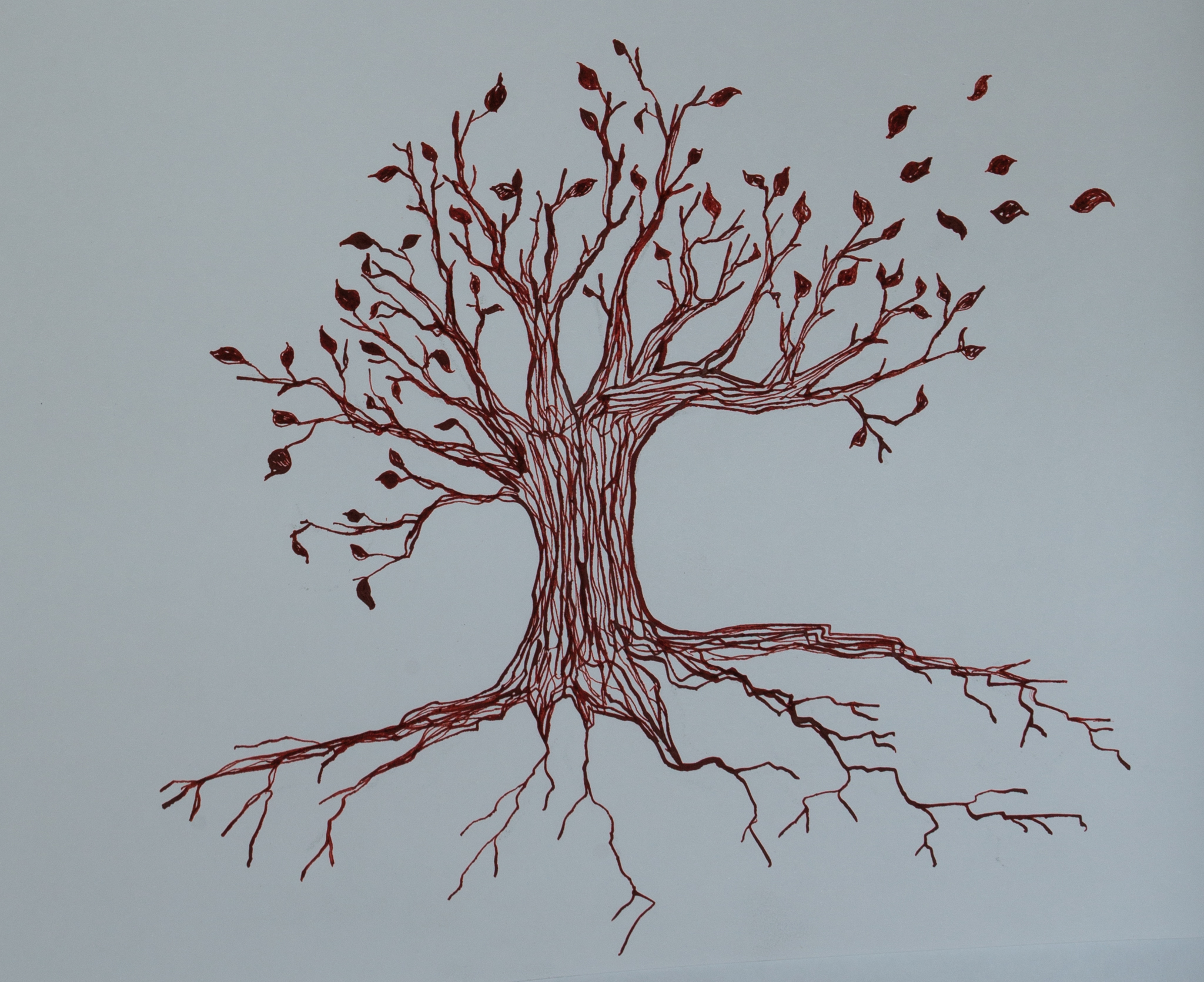
On a small section of layered background map I have tested combining my images and drawings to help me get a feel for the final image, I painted in a light wash of watercolour over the tree trunk and wall to visualise how it would all look together. This had given more depth to them. The tree does not need to be so large or even be complete figuratively. I’m now thinking perhaps drawing in a section of tree branch or half of the tree could also add more impact.

Poetry

Also, I have been researching and reading Zen poetry and mindfulness poems and have enjoyed the poems of Danna Faulds, a well-known yogi and mindfulness poet.

Being Present’ by Danna Faulds

 Breathe, relax and feel;

take time to slow down the pace of life.

Watch the rise and fall of moods,

the birth and death of dreams.

Feelings and sensations seem so real,

yet they shift like changing clouds,

and flow with the high tide out to sea again.

Allow it all to be, no need to grasp or push away.

Present with each moment, the whole of you,

body, mind and soul, open to receive.

I recently created a couple of ‘found ‘ poems composed from random words linked to the process of mindfulness which I cut from magazines. Perhaps I could paint or write/illuminate my short poems into my artwork- above the face? Or maybe in the border of the map?

Poems On Maps

There are some very interesting search hits on map-based poems or poems written on maps. https://360.here.com/2015/07/11/the-poetry-of-maps/. Whilst further researching cartography, I discovered an emerging artist called Gommie, whose mentor is Kate Bryan. https://theglossarymagazine.com/arts-culture/best-british-artists-to-buy-now/#.YH2gbuhKjIU. Ollie Gomm/ “Gommie” spent a year travelling on foot around the British countryside using Ordnance Survey maps to navigate his way and writing mindful poems onto these maps and he creates artworks from them, it’s a really interesting and pleasing concept.  He writes about things said in conversation with people he meets and his thoughts at the time. www.gommie.co.uk

 Leaf Mandalas & Ephemeral Land Art

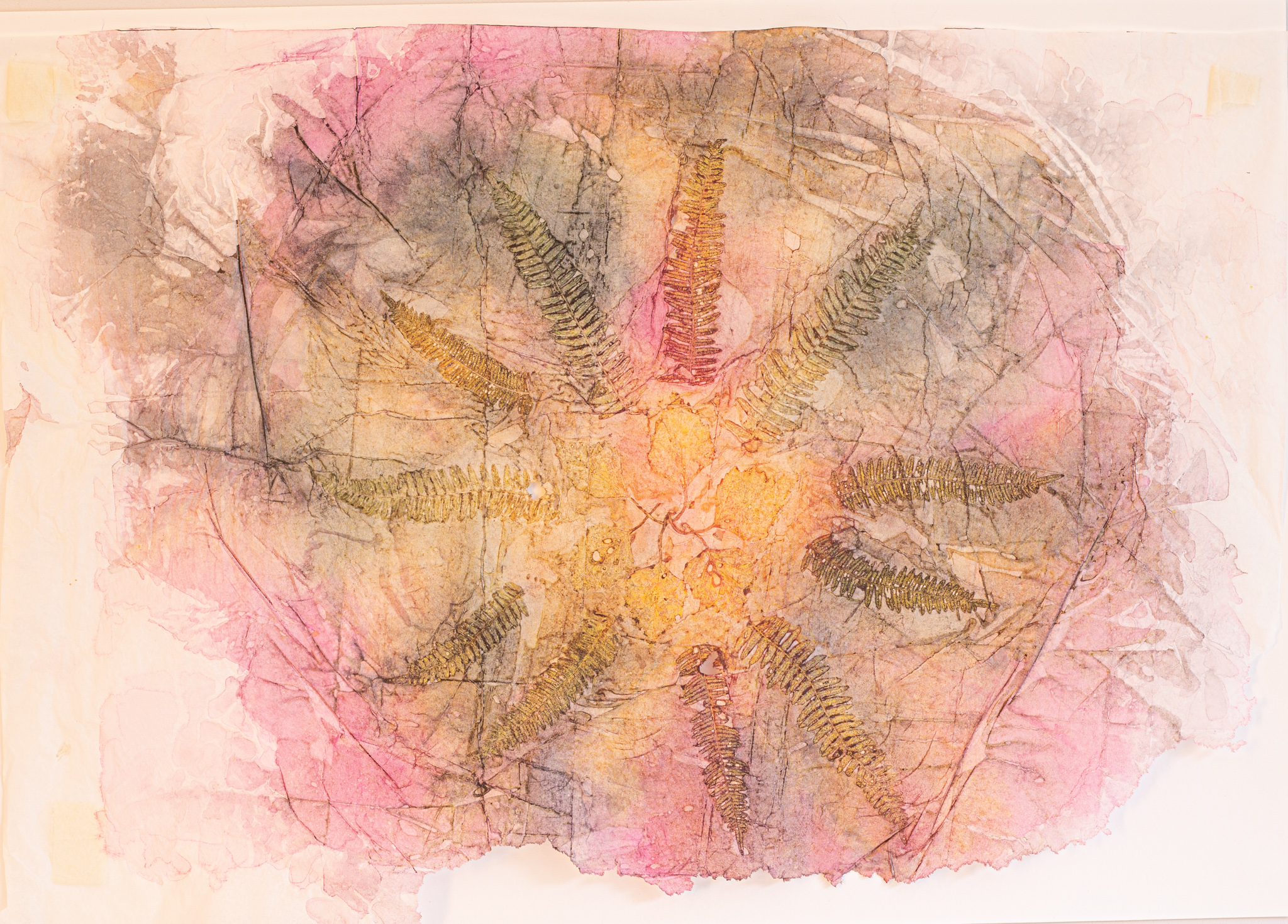
Nature provides a soothing, restorative balance and its ‘raw materials’ are a source for unlimited inspiration. I have researched Andy Goldsworthy a British sculptor, photographer and environmental ephemeral land artist who works with nature in nature. https://en.wikipedia.org/wiki/Andy_Goldsworthy . He creates beautiful nature sculptures /leaf mandalas and natural land art using only found items such as twigs, leaves and pebbles in situ from the natural environment.  I experimented with creating fern/leaf mandalas in watercolour wash or print with watercolour. See https://mossandfog.com/andy-goldsworthy-fall-leaves/ for beautiful images of Andy Goldsworthy’s work.

Eco Printing Effects

Eco printing also creates some beautiful natural outcomes, but involves hours of boiling/steaming leaves bound into papers or cloth, and weighted by large stones in a old pan, with added rusty nails for depth of colour. Not wishing to fog up my kitchen, wreck a perfectly good saucepan, and not having any rusty nails to hand (!), I reflected on how I might achieve a similar effect. I decided to experiment with watercolour, ferns and tissue paper and I achieved some pleasing effects. My outcomes were quite similar to those of Eco prints. I will test collaging some sections of the watercolour prints I made on my test map. The colours of the leaf and fern outlines are not quite dark enough to show up well, and I will continue to develop this by using darker shades.https://www.instructables.com/How-to-EcoPrint-on-Paper/

Also, I’ve been reading a book called “Magnificent Maps: Power, Propaganda and Art” by Peter Barber and Tom Harper – many old maps have compasses (rather like a mandala) and grid lines radiating from them, with text. Not sure how this would look, could I incorporate some of these lines, or would that be too much detail? It might result in a very busy piece of artwork…. The hand-inked maps and legends

This week I’ve been further experimenting with my artwork detail by testing developing and drawing stars, using chalk pastels and acrylic inks, India ink wash and Paynes grey watercolour. These will be faded into the top left-hand corner section of my artwork map.

Easter Break – Reflections and Progress

I’ve made good progress and have been reflecting/evaluating  how I will bring all my images together since my last tutorial session. Further  tests with layers in gesso over an ordnance survey map worked well with a further layer of watercolour wash. I assessed the colour palette of my backgrounds I had painted in watercolour on deli paper, tissue papers and onto the gesso so far was not quite the right look I wanted to achieve. I further produced some watercolour washes in “sunset” colours, which are definitely more aligned with the colours I see when closing my eyes and meditating. I tested watercolour blues and greens using hemp string, leaves and ferns weighted down whilst the paper was drying to create an opaque monoprint. This was fairly successful, but I think the warmer shades work better. My background style and colour palette is now established, and I have developed several dip pen drawings to incorporate into my final artwork.

Monoprinting: This past week I took a minor detour and experimented with Gelli plate monoprinting using leaves, fine tree roots, and birch twigs to see what sort of natural fractal effects I could create to possibly blend into the background of my artwork. The prints were not particularly successful, but some resulted in beautiful leaf and root structure prints, and the process was meditative in itself. I had further researched making collograph prints, but with the Easter break and a long delay in being able to go on campus to book time with a support technician to use the intaglio press, I decided not to pursue this at such a late stage.

Having now developed the elements I want to incorporate into my final piece I have also been testing opacity of layers and arrangement of my images within Photoshop, (with some intense training from my personal tech support (husband!) This has given me an excellent overview of how I want my final layout to look. I also found that the linework in a few areas of my drawings needed to be bolder.


This week I’m in the process of re-drawing and further developing (using dip pen and ink) individual layers of my drawings and testing sizes of the images within Photoshop to finalise my artwork, and will incorporate some of the surface patterns I created on deli papers early on. My first drawing images were drawn with dip pen in a teal colour, but this does not combine well with the sunset colour palette. My next test drawings were done in black India ink which appears too harsh, but it gave me a clear vision of what I have developed so far, and these black and white images helped me to see more clearly how to progress. I have a Daler Rowney red-brown acrylic ink which I will test, and I think either this or a sepia colour ink would work well in the final piece. I find Photoshop so complicated to use, I need technical support, but it is a huge asset when combining it with adjusting size and opacity elements elements of my hand-rendered artwork. I finally feel satisfied with my progress to date and I have a clearer path now to complete my project.

I remember seeing a photo of a meditative natural garden sculpture and managed to find it – the “Mud Maid” from the Lost Gardens of Heligan in Cornwall (otherwise known as the “Sleeping Goddess”). She has the serene qualities I want my meditating face in my artwork to have. Incidentally, I have realised that my History of Art ‘A’ level (studying Renaissance art) has subconsciously given me inspiration for my meditating face image – in the form of Botticelli’s ‘Primavera’ and ‘Birth of Venus’. Today, I spent a while studying these beautiful paintings online. ONE day, perhaps, I would like to admire them face-to-face at the Uffizi in Florence, to appreciate the narrative, colour and detail of them with the naked eye.


Reflection following Tutorial

I have so many ideas and test images/sketches /backgrounds that I’m now totally overwhelmed as to which I would like to incorporate in my work. Reflecting on the feedback from my last tutorial and discussions with Rachel, I have pared down the images I want include in my mindfulness map. I had too many elements in there and need to narrow my content down further. I have developed my backgrounds further with combinations of map sections washed with gesso, emulsion paint and matt medium and will test out watercolour backgrounds on these and decide which colours are most pleasing. I have also experimented printing mandalas with leaves and ferns using watercolours, and researched Andy Goldsworthy’s inspirational land art and ephemeral leaf nature sculptures https://www.sculptureplacementgroup.org.uk/sculptures-at-home-3-andy-goldsworthy/

Initially, I envisaged that the Map of Mindfulness could be a “seascape” on one side and “land/nature” on the other, but I realise now that this is too much – there would be too many elements to incorporate and it would not look cohesive. It needs to be less cluttered and more non-figurative. I have edited a good, smaller selection of sketches now for images I will incorporate, and will definitely include tree branches, leaf fractals and a meditating face (but NOT a Buddha – that’s far too typical and conventional!). Also, I have decided that the map will be single-sided and will not fold. I want it to be shown in a gallery setting.

A suggestion from my last tutorial was that I could incorporate collograph printing and I spent a while researching this possibility further. West Dean College of Arts & Conservation had a good home collograph tutorial by Vicky Oldfield on You Tube which I watched several times. https://www.youtube.com/watch?v=P2jwWjSyweQ . Having given this careful consideration I have decided not to include this in my work at this stage, as it will add another element which I don’t think is not the look and feel I am wanting to achieve, which is filmy and ethereal. It is also difficult to visualise how to create an image which would fit with my work, giving it a dream-like opaque quality. I want to achieve the effect of thin transparent, ephemeral layers. I am continuing to explore other collograph printing websites by printmaker artists Anna Curtius, Belinda Del Pesco, and other You Tube art education videos, so I have not completely dismissed this.

https://www.annacurtius.com/blog/how-to-make-a-collagraph-print-in-four-steps

In my ongoing research of cartography I have also been researching map illustrators from a magazine article, “Well Mapped Out” in the March 2021 edition of The Guildford Magazine https://edition.pagesuite-professional.co.uk/html5/reader/production/default.aspx?pubname=&edid=0ab41d9a-e86e-4151-8f6e-7c66de32ff2f&pnum=16

– Nicola Howell, Camilla Charnock and Lisa Tolley and create stylised maps of places, and looked at Roberta Faulhaber’s art mapping/mind mapping work. https://robertafaulhaber.typepad.com/blog/2010/03/artmapping.html

There are some thought-provoking gentle meditative Zen mindfulness poems which have led me to think about including a few words or possibly a quote? This inspired me to experiment with creating my own “found” poems by using words cut from magazines and books to create my own sentences about mindfulness. It’s an enjoyable process, but am I digressing again?

Look After Yourself

Look at the world differently.

Discard the bottled torrent river.

Unwind with the breath in the smallest of moments.

Step by step you reveal an oasis of calm.

Appreciation. Being. Watching.

Experience the now.

Looking to Focus

Connect yourself with nature.

The present moment unfolds.

Breathe slow, make strands that flow.

Shine from the inside, let go.

Tutorial & peer feedback 26th March

Beth: could you try overlaying the images you have digitally?

Rachel: contact Kevin Lawton the Fine Art technician at AUB for acces to testing out collograph prints?

Beth:  I think that the experiments look really lovely and calming, it looks like you are on the right track and I think testing lots of ways of doing things quickly will help you decide what you like

Wiktoria: I really like the natural look of the prints! it’s very free flowing which made me think of consciousness and positive thoughts? I don’t know if it was intentional but the connection between nature and mindfulness is really nice. I felt relaxed looking at them 🙂 also the textures were very interesting and effective

From Rachel : Have a look at Matteo Zamagni’s modern practice – VR/CGI fractals – immersive experiences

https://www.annacurtius.com/blog/how-to-make-a-collagraph-print-in-four-steps

Cyanotypes

Beth:  Cyanotype would work lovely with your leaves.

Experimenting with composition and materials

Yesterday, I tested sections of ordnance survey maps with a thick gouache wash over them, tested transferring maps to cartridge paper as a background. I also mixed a beautiful pale green colour for a background. This map needs to be simpler and have fewer elements. I want it to be cohesive and not cluttered. I’m back to the form of a map again. This is the way forward, and I really need to get cracking now. The ides of March are marching on!

I want to draw out the map layout using dip pen, with a path running through it maybe? I tested drawing my images with a dip pen using black ink and also blue-green acrylic ink. Both looked good and I like the effect of the acrylic ink.

The idea I have is for the background to be pale yellow or green (map palette) colour and have tested colours and effects. I sprayed, with a pump bottle, watered-down pale lemon yellow watercolour paint mixed with gouache onto thick cartridge paper.  The colour turned out well, and it could finally be a possibility.  Is it too pale, does it need more detail or layers? I also mixed and tested a pale mint soft green shade watercolour with white gouache, this was too vibrant for a muted background colour. I blotted it with some kitchen paper and accidentally achieved a pleasing effect of decreasing circles – a sort of reduction print really.

Once the sprayed lemon yellow background layer had dried, I tested using mono prints of watercolour blended “clouds” onto it, blew onto the wet paint to achieve some beautiful muted rainbow colour blends. These are the colours I see when I close my eyes and meditate. I’m unsure about these backgrounds though and I think I need to test more ideas.

The next step to identify which pieces of leaf fractals or printed birch twigs I might want to include to create a mindful image of a map. I also think that some appropriate words are needed in order to give the sense of mindfulness of this work.  I have cut out some random words from magazines and newspaper and created random, but relevant, “poetry” with them. I’m thinking that perhaps I could collage these words on the paths that wind through the map? I want to somehow create layers, but don’t have the time to teach myself to do it in Photoshop. I also like my artwork to be analogue. (It took me a good couple of hours this afternoon to work out how to add a heading to my blog!) I just seriously don’t have the time it takes me alone to learn how to do these tasks. This is the hardest bit of lockdown and learning remotely. It is clear that I need to develop my digital Photoshop skills, but now is not the time.

Storytelling Workshop & Tutorial Feedback

Today’s zoom workshop was on sketching and storytelling narrative through sequencing. The session highlighted to me that a) I need to sketch more frequently b) I suck at drawing people – especially hands.  They have no 3D-ness about them. It’s something I must address, although we have had zero life-drawing classes this year, and I haven’t had any enthusiasm to practise it myself. Definitely more sketching practice required.

Feedback – (from Clare Baskerville)

Look at the Smithsonian Library Artist Books collection online (Rachel mentioned earlier)  – amazing selection of books that books, more like pieces of art, they include ephemera and many other things.

Look at using mark making lines/dots to show a path on a map. The very act of making dots and marks is meditative. Or use smaller pieces of a map? Perhaps further explore monoprinting using leaves. Refine the colour palette – maps have a quite a delicate colour palette. Look at O/S maps colours. Remember that maps are very fixed geographically – will mine be?

My reflection following this:

What do I see when meditating = many beautiful colours blending and swirling into patterns.  Mindfulness in nature is about biology and nature, getting away from hecticness, being calm. Bringing it back to the here and now, and repetition of pattern and thought – dots, lines, circles, making creative repetition and varying intensity.

I could incorporate a small piece of a map with sections of noisy and also calm with pathways coming from them. I have too much to include in one picture and am now considering a handmade concertina style artbook instead? (– no bigger than A4 size. Maybe A5 (too small?) or square? 20cm x 20 cm ?)

  • Or I could create a zine, but having researched zines, I think it is not detailed enough for the style of image I want to use.  The concertina book could have pull-outs or pockets and added ephemera? Start from pale O/S map colour palette and go though the book gradually blending and progressing the colours to a colourful finale of a meditation image?

Maps, Materials & Fractals

I have thumbnailed various sketch ideas for possible layouts of a single piece of artwork as a “map”. None are quite what I want. I have been further researching different types and styles of art maps.  Qiu Zhijie and Roberta Faulhaber, maps of mind maps … to establish what the composition of my map might look like. It could be a map but not a traditional map, but abstract, fantasy – possibly an overall view of comparing tree branches/veins/arteries, roads, tree roots patterns. They are all very similar and I am thinking of ways to combine them.

I have so many ideas this week and was keen to get something properly creative onto paper. I have experimented with various patterns, from simple monoprinting with acrylics, and creating flowing flora and fauna loose patterns on deli papers and cartridge paper. I limited my colour palette to warm hues of apricot, golden yellow and magenta pink (which was too bright) The outcomes looked very amateur and not the look I want. I  will test some watercolour washes next in similar colours, and test blues and greens but they may be too close to underlying map colour to be a visually interesting contrast.

Using a dip pen to draw with watercolour, black ink and high flow acrylic inks,  and also mark making with sticks and twigs, I achieved some good effects and made some preliminary sketches of images I would like to use which convey the sense of general wellbeing. Some of my mark making and monoprinting was done onto deli paper, but there is a sharp crease down the middle of each sheet. I will test tissue paper next, however I think this will be too delicate and will probably tear when wet. I will order some extra tough wet strength tissue paper which is used in making paper lampshades and test this.

The images I want to incorporate are a dip pen outline of an ethereal female face, with flowing hair, eyes closed, peacefully meditating. I also want to include ferns, sea shells, waves, stars, tree branches and sun rays.

My test drawings are too cluttered, there are too many components that I want to include. My next step is to be selective and whittle down the images which work best combined in the composition. Should I create one piece of gallery artwork in order to fit everything in – how big though ? A3, A2?  Will the images lose their charm if they are too big? Will they look lost? How will I scan the final artwork or photograph it digitally if it’s so large….

I really need to test more to establish which patterns, and what mediums to use. How do I also bring in ephemera into it as well? It feels like a “supermarket sweep” at the moment, there are so many things I want to put in my trolley!

I bought an old ordnance survey map of Bournemouth and photocopied sections of it, onto which I tested a whitewash: I used white gouache layers, scumbled white acrylic and paint, and washes white acrylic high flow ink. The paint layers in all three were not thick enough and the paper became very wet. There is a risk of damaging the map if I don’t get the correct consistency for the paint wash. It needs to be opaque enough to see the map through it, but not so that the maps overwhelms the rest of the images. I used Nori paste (very much like wallpaper paste) to glue the paper down. I have previously used Pritt stick but this is a bit too patchy and not particularly long lasting. The Nori paste crinkled the paper, despite weighting it down, Golden matt medium worked well.

I need to keep reminding myself  – what is my aim:

Mapping the sensory effects of wellbeing on the mind

Or to visualise the sensory effects of nature on the mind through mindfulness for wellbeing.

My next steps:

  • to establish what my background will be
  • to establish what form the piece will take – book or large piece of work?
  • To establish what details to incorporate

So far I think my idea is too dry – does it necessarily have to be a literal map?

I have also found a superb poem by Jack Kerouac “On How to Meditate”. I think I would like to include a mindful poem, or lines from one in my piece, and will research poetry further.

https://www.faena.com/aleph/jack-kerouacs-instructions-for-meditating