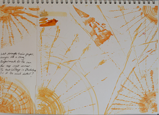
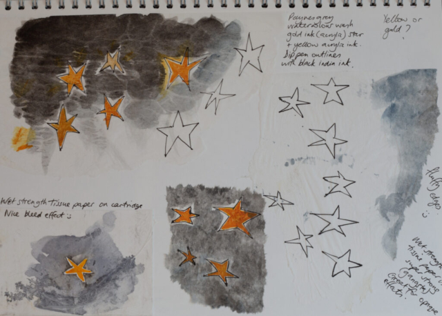
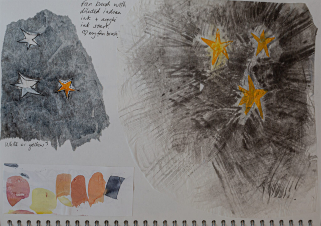
I tested physically collaging painted tissue paper variations of suns and stars onto my map, and took photos. Then I asked for technical Photoshop assistance from my home tech support (lovely husband), so he/we digitally placed the sun and stars on my Map of Mindfulness artwork. This made a huge realistic difference to the overall composition balance. I asked for opinions (“better with/without”) from family, friends, and a few course peers on whether they were too much detail, and should the space be left empty or not. Some said that all spaces on a map should be filled in some way. This certainly seems to be the case in old maps that I have looked at online and in cartography books. My friend Syd recently posted a picture of his historical maps calendar on Facebook – it’s an old map by renowned cartographer Gerhard Mercator of ‘Scotia Regnum’ ca 1595 https://maps.nls.uk/view/00000207. I studied the cartouche closely, and sketched a very rough idea for a possible cartouche for my map.
I’ve reached the conclusion that my map looks balanced as it is without any additional detail. This Map of Mindfulness is a metaphorical map, it’s not directional, the places on it are infinite and they only exist in my meditational practice, everyone’s “map” would be different. It’s not so much as charting the route, but is instead showing one of many journeys which can be spiritually taken in the process of mindful practice.


