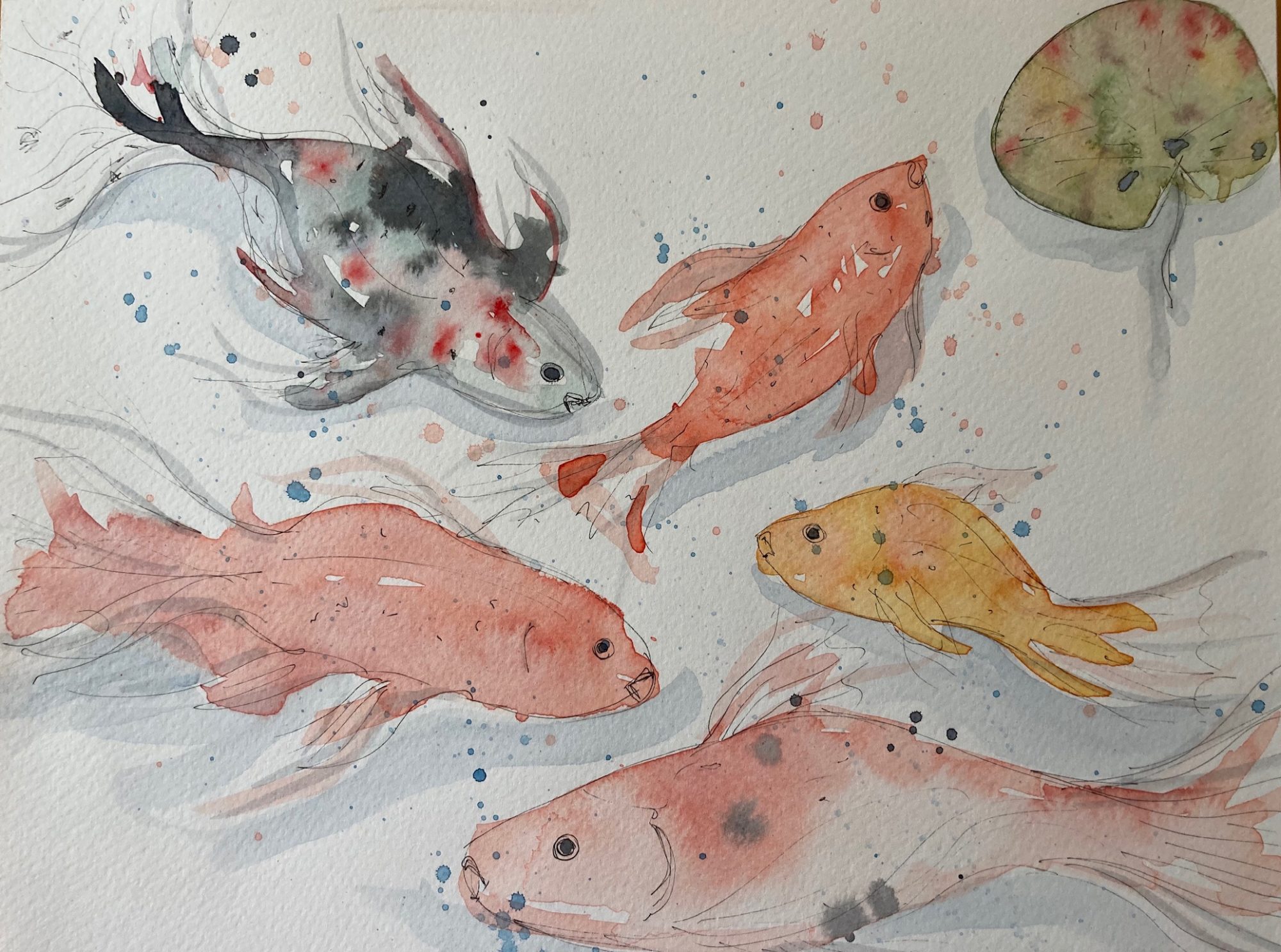
I’ve made good progress and have been reflecting/evaluating how I will bring all my images together since my last tutorial session. Further tests with layers in gesso over an ordnance survey map worked well with a further layer of watercolour wash. I assessed the colour palette of my backgrounds I had painted in watercolour on deli paper, tissue papers and onto the gesso so far was not quite the right look I wanted to achieve. I further produced some watercolour washes in “sunset” colours, which are definitely more aligned with the colours I see when closing my eyes and meditating. I tested watercolour blues and greens using hemp string, leaves and ferns weighted down whilst the paper was drying to create an opaque monoprint. This was fairly successful, but I think the warmer shades work better. My background style and colour palette is now established, and I have developed several dip pen drawings to incorporate into my final artwork.
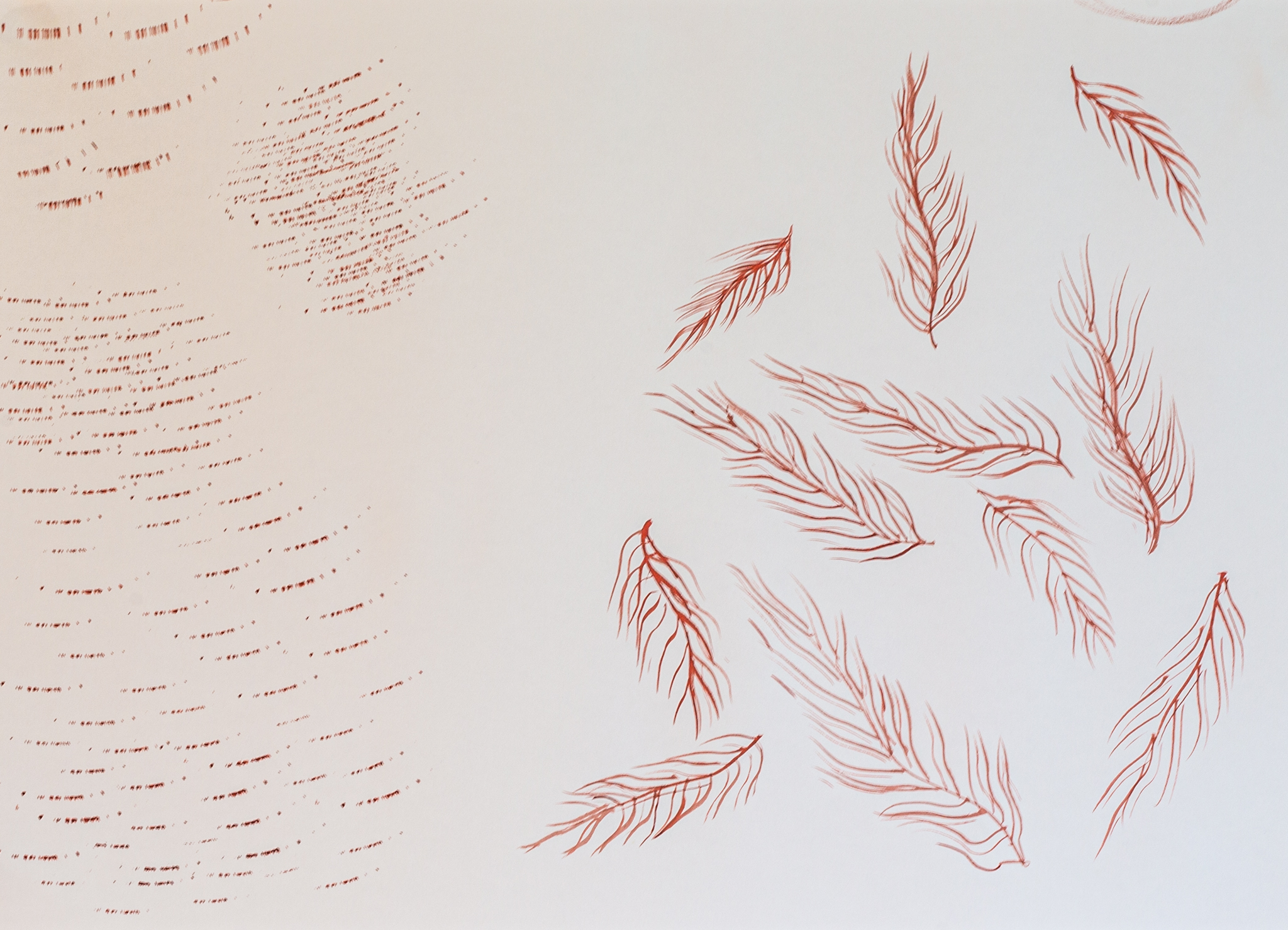
Monoprinting: This past week I took a minor detour and experimented with Gelli plate monoprinting using leaves, fine tree roots, and birch twigs to see what sort of natural fractal effects I could create to possibly blend into the background of my artwork. The prints were not particularly successful, but some resulted in beautiful leaf and root structure prints, and the process was meditative in itself. I had further researched making collograph prints, but with the Easter break and a long delay in being able to go on campus to book time with a support technician to use the intaglio press, I decided not to pursue this at such a late stage.
Having now developed the elements I want to incorporate into my final piece I have also been testing opacity of layers and arrangement of my images within Photoshop, (with some intense training from my personal tech support (husband!) This has given me an excellent overview of how I want my final layout to look. I also found that the linework in a few areas of my drawings needed to be bolder.


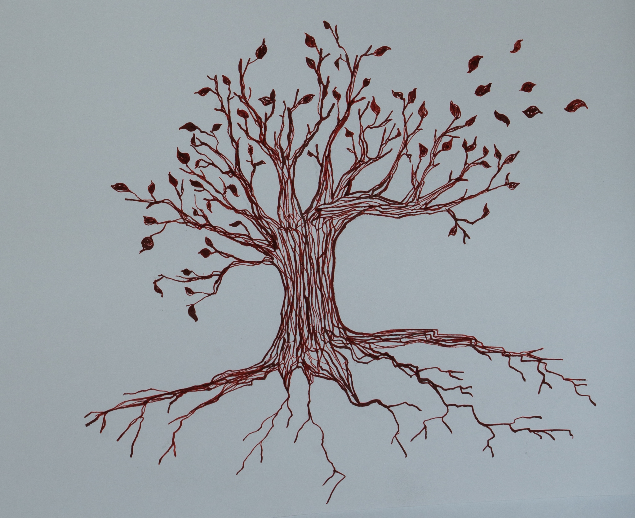


This week I’m in the process of re-drawing and further developing (using dip pen and ink) individual layers of my drawings and testing sizes of the images within Photoshop to finalise my artwork, and will incorporate some of the surface patterns I created on deli papers early on. My first drawing images were drawn with dip pen in a teal colour, but this does not combine well with the sunset colour palette. My next test drawings were done in black India ink which appears too harsh, but it gave me a clear vision of what I have developed so far, and these black and white images helped me to see more clearly how to progress. I have a Daler Rowney red-brown acrylic ink which I will test, and I think either this or a sepia colour ink would work well in the final piece. I find Photoshop so complicated to use, I need technical support, but it is a huge asset when combining it with adjusting size and opacity elements elements of my hand-rendered artwork. I finally feel satisfied with my progress to date and I have a clearer path now to complete my project.
I remember seeing a photo of a meditative natural garden sculpture and managed to find it – the “Mud Maid” from the Lost Gardens of Heligan in Cornwall (otherwise known as the “Sleeping Goddess”). She has the serene qualities I want my meditating face in my artwork to have. Incidentally, I have realised that my History of Art ‘A’ level (studying Renaissance art) has subconsciously given me inspiration for my meditating face image – in the form of Botticelli’s ‘Primavera’ and ‘Birth of Venus’. Today, I spent a while studying these beautiful paintings online. ONE day, perhaps, I would like to admire them face-to-face at the Uffizi in Florence, to appreciate the narrative, colour and detail of them with the naked eye.