Completed Artwork for Final Submission

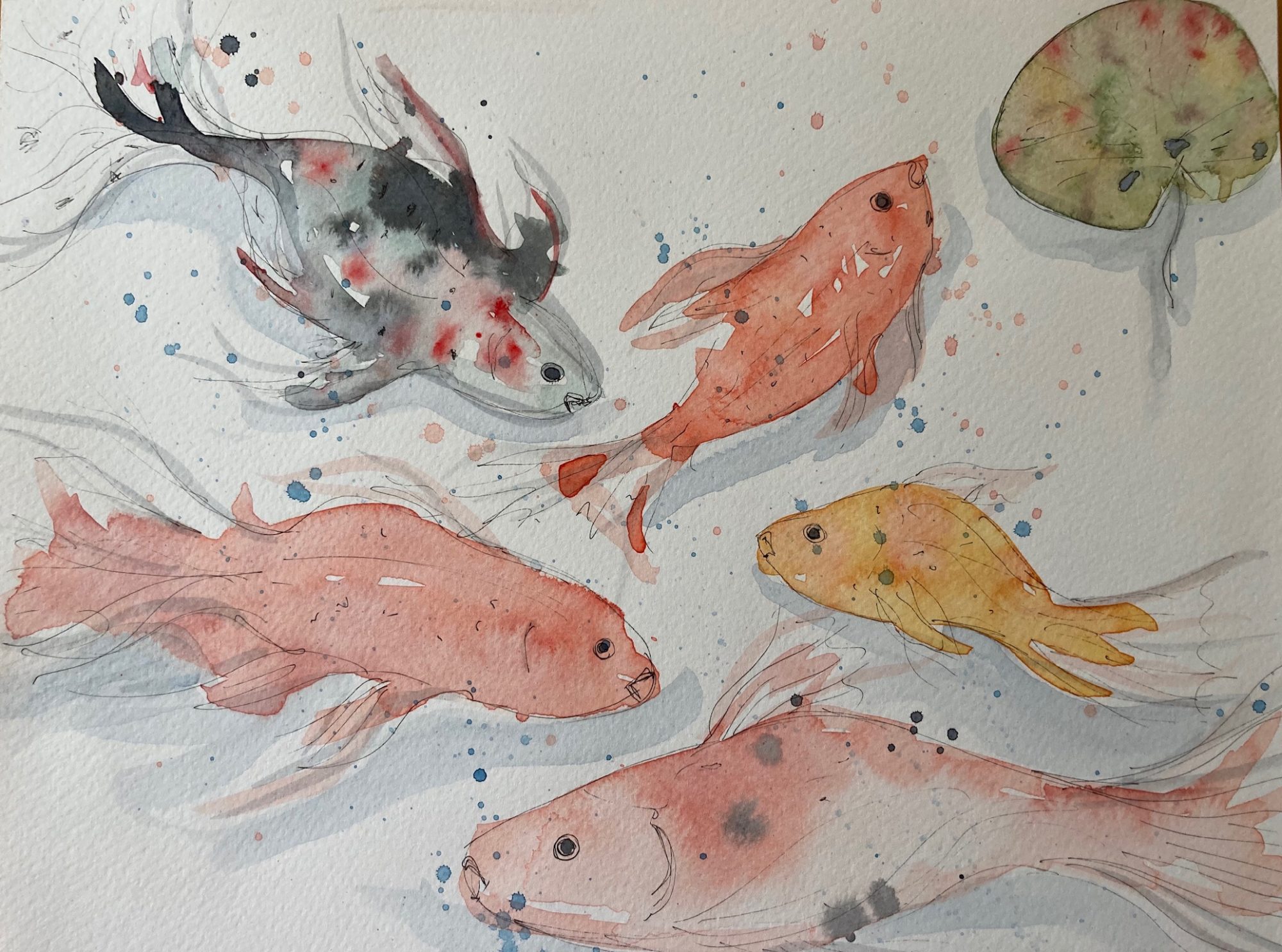
Presenting (above) my body of work for submission for the Final Major Project. The main image is a “Map of Mindfulness” – my completed artwork as described from my proposal at the start of the project. This map is not a map by which to find a route, it is a symbolic dreamlike representation of an imagined meditational place, highlighting the connections between nature and mindfulness. My research and development of ideas has been mostly relevant in guiding me to this end result. I have read extensively about the benefits of meditating and finding relief from stress and anxiety in nature (in mental health forums and in published research about the benefits of spending time in nature), how fractals are found everywhere and how they relate to maps and human and biological anatomy. At one point I was quite overwhelmed by the different ways of illustrating a map, from fantasy to geographical.

Throughout my project I have regularly referred back to my initial proposal to review that I was achieving what I had set out to accomplish, and also to check that I had not changed my course. Once I had established what elements to include to create a mindful feeling, the process began to flow more easily and the next stage was deciding on the style to use in my work. The most difficult decision was in establishing the overall composition of my map as it is not meant to have a fixed path but an imagined one in the mind. By overlaying my layers onto an Ordnance Survey map I was able to link a topographical map with an imaginary atmospheric one of meditation. I wanted there to be a connection to the “here and now” by showing an actual topographical base layer, but also to visualise a serene sense of meditation.

At the start of Stage 2 I didn’t relish the task of meeting a set brief and just wanted to make art for art’s sake. Since then, I have worked through the design process, and really enjoy the challenge of designing a proposal and meeting a brief. The first idea is not always the best idea, and unexpected outcomes can be developed from experimentation, reviewing and remixing ideas. I definitely enjoy working to a short brief and always like to include some meaningful text with my images. My initial pathway was Fine Art, but my practice has significantly developed throughout the projects and now my interests lie strongly within authorial Illustration. I am also interested in printmaking processes, and experimented with collograph printing in this project, but was unable to get the ethereal effect I wanted as the paper used is very thick. I am a novice at digital rendering of art, and had my skills been more advanced I would have used some of the elements from my collograph prints. I have included my prints in my final submission of my body of work from the project, and displayed them in a (free) virtual gallery exhibition mock up on Kunstmatrix. I will submit them for inclusion in Emerge 2.1 class of 2021 exhibition.

The clearest aspect of Foundation from the outset is that I feel I have been forced down a digital illustration route, and sometimes the pressure to use digital illustration has been very stressful. I am not very technically minded so using Photoshop and Illustrator have been challenging, especially during lockdown over Zoom! However, I have pleasingly had some success with using them as a support tool rather than producing or designing art digitally. They will certainly be beneficial to my practice in the future. It has become clear that I need 1:1 tuition in learning Photoshop, Illustrator and Lightroom, and it is on my “To Do” list in the near future, as I am keen to build competency in these skills. An unexpected technical complication was in adding photos from my iphone to my blog. The size of each image was too large, and I needed extensive help from my husband Ashley in changing the image size by re-photographing them with his Canon camera and uploading them in RAW format, then converting them using Lightroom to jpg. format. I should have started adding sketchbook and progress photos to my blog earlier in the project and then perhaps I could have learned this as I went along!

How to Write an Artists Statement

I think it’s quite a challenge for a creative to explain their visual work in words without it sounding pretentious or abstract. It seems that a good artist statement should be brief and explain the work and what it means … it is not a comprehensive description of an artist’s work, but a statement leading the viewer into the work.  I researched several examples online from student artist statements to practising artist statements– starting with looking the Saatchi Gallery website to see what type of statements their exhibiting artists have who have a similar ethos in their work to mine.

https://www.format.com/magazine/resources/art/how-to-write-artist-statement  advises to ask yourself some questions about your work:

Who is your audience? Who are your influences? Explain your work to a child. How do you make your work? How do your materials inform your concept? How is your work unique? Long blurbs containing jargon and abstract terms are dull and boring. (arty bollocks!).

The online “Arty Bollocks Generator” is a prime and comedic example of this –  and there is also a serious recommendation for bona fide practical guidance on how to actually write about art – a properly helpful book by Kate Kramer “Artists Write to Work – a practical guide to writing about your art”.  https://www.artybollocks.com/generator.html

I then read an online magazine and blog BmoreArt run by artists for artists, and this really helpful article https://bmoreart.com/2009/04/best-professional-practices-for-artists-2.html   “The Artist Statement & Why They Mostly Suck: Best Professional Practices for Artists: The Artist Statement Made Simple”. Now to actually write mine ….

Preparation for final submission

http://mandmade.co.uk/wp-admin/edit.php?post_type=post

Over the weekend I’ve been busy gathering everything I’ve done in Stage 3 ready to submit in one pdf. (From scraps of paper and shopping lists with ideas and thoughts scribbled on the back, to random doodles …) At the beginning of Stage 3 my first attempt at uploading photos onto the blog taken with my iphone was hindered by each photo having to be individually adjusted as the file size was too big. Thanks to my home tech support (lovely husband) we are now speeding up this process by rephotographing them (RAW). My son’s bedroom has been turned into a make-shift photographic studio and I’ve been photographing my sketchbooks, test materials and my final artwork in RAW format. I am now editing them in Adobe Lightroom – cropping and re-sizing the images, adjusting the light, white balance, exposure, contrast colour vibrancy and saturation to show good quality images of my work. This is quite a lengthy process but will be worth it as my blog needs visual evidence, it’s been rather text heavy for a few weeks, but all will be re-edited to include the photos.

Emerge 2.1 – This will be an online live exhibition showcasing the work for the class of 2021 Foundation, which will be available for anyone to view for a year. The AUB Marketing department have given us guidelines on how to submit our work or “assets” – requiring a minimum of three “assets”. Our very first proper exhibition (for most of us at least).

This morning’s seminar briefed us on the requirements of where/how to submit our work. Once we’ve submitted our entry the marketing department will then curate/edit our submissions. I need to write a brief “artists” statement (around 100 words) about my work.

Artist Practitioners Researched

There are several artists whose practice has influenced my project in one way or another, from old masters to metamodernist emerging artists through their diverse use of theories of composition, perspective, subject matter and colour. My research has also covered many different types of map from ancient maps, old world maps by Gerhard Mercator and abstract maps by modern map illustrators from Julia Gash to Grayson Perry.

Jackson Pollock for his use of hidden fractals within his paintings. Physicist Richard Taylor researched artworks containing fractals. Jackson Pollocks works were made by his unique way of moving and balancing when putting the paint down on canvas to create his artworks. (Apparently there is a “fractal fluency” and it’s easy for an expert to spot a fake).

Botticelli – “Birth of Venus” and “La Primavera” – the spiritual and allegorical narrative of his subjects and the inclusion of botanicals and nature was particularly inspiring. The flowing hair of his serene female figures has been in the back of my mind throughout this project, and they have an ephemeral quality which echoes the allegorical/spiritual story of his paintings.

Nadja Gabreila Plein’s mindful and observational drawings and paintings of tree and root fractals, and her use of colour and viewpoint. Leonardo da Vinci‘s sepia sketch “Head of a Woman” – she is thoughtful and calm , and the sepia medium he used influenced my colour palette, the attitude of his female muse echoes the effect I want my work to convey. Artist Helen Wells holds similar interests to my own in the observation of nature and organic subject matter, I like her use of abstract fractal pattern and layers which create depth and interest in her works. Val Britton for her colourful abstract maps, Grayson Perry and Qui Zhijie for their fantasy maps, Gerhard Mercator’s traditional Old World cartography, and Matteo Zamagni – his immersive metamodern CGI/ Virtual Reality immersive live reels of computer graphics and biological images taken from nature, remixed creating ever-evolving hypnotic fractal patterns. The king of natural and ephemeral art is Andy Goldsworthy – his captivating organic leaf mandalas and sculptures created in their natural landscapes with found natural components, which eventually dissolve and return to the earth.

Metamodernism

Modernism – Postmodernism – Metamodernism

This week’s art theory lecture was expanding on last week’s discussion about Modernism, Postmodernism and the cultural philosophy of Metamodernism.  I’ve spent some time researching it, there’s plenty of information online and Huff Post contributor Professor Seth Abrahamson has written several thought provoking essays on metamodernism.

The term ‘metamodernism’ was first used in 1975 by academic Mas’ud Zavarzadeh. Then around the 2000’s it began to be more widely referred to in culture. “By the mid-to-late 1970s it was clear that what the postmodern exertions of the 1960s had produced (along with much wonderful public policy) was an unanticipated side effect: a decay, disillusionment, and despair at the heart of American culture …” (Abrahamson, 2017). There was a need for an evolved cultural philosophy, and the internet played a large part in this shift. Cultural philosophies have a life span of about 50 years, but technological evolution often prompts a new cultural philosophy:

Romanticism ca 1790- 1850

Victorianism 1840 to 1900

Modernism ca 1890 to 1945  Modernists such as Picasso, Nietsche, Freud, Einstein, Schoenberg, Virginian Woolf were experimental and progressive in their artistic practices. Political and technological advances influenced their work, they stripped away facades and questioned and experimented. (The Age of Radio)

Postmodernism 1945 to 2005 The movement drew attention to contradiction, irony, meanness, scepticism, context and marginality – Andy Warhol, Jeff Koons, Robert Rauschenberg, Joseph Kosuth, punk rock, Brett Easton Ellis, Baudrillard, Derrida.  There was an overall cultural “sense of glee” at embarrassment, hope, enthusiasm etc .(The Age of Television)

Metamodernism reconstructs things by joining their opposing elements in an entirely new configuration rather than seeing those elements as being in competition with one another.” (Abrahamson, 2017).  Think GIFS, think Lego Movie, Team American, Buffy the Vampire Slayer , Shia LeBoeuf, Chris Ofili, Zarah Hussein, Olafur Eliasson, Childish Gambino, Billie Eilish…. Metamodernism  is generally referred to as oscillating between two extremes to create something new. It’s remixing to create a new outcome. (Which is what we experimented with in Stage 1 of the Foundation Course). It combines whimsy with spiritual depth, and is an unconscious cherry-picking of the best of modernism and postmodernism, it brings back the essence of humanity and interiority allowing self-expression which is both positive and negative. We are all individuals with an interior world. Are we entering an “I agree to disagree” era and moving away from “I am right, you are wrong”?

Interestingly, I couldn’t find any links to Metamodernism on the Tate Modern’s website. Is this because is it still classed as a contemporary and emerging movement, and not yet established enough for a genre in its own right? Is that what “modern”art is?

See www.whatismetamodern.com ”What is Metamodernism and Why Does it Matter?”an essay by Greg Dember (May, 2020).   https://thesideview.co/journal/what-is-metamodernism-and-why-does-it-matter/ He states that in the arts and in contemporary social trends there is a current complex sense of playful irony, and experimentation in the intricacies of being human.

https://www.huffpost.com/entry/what-is-metamodernism_b_586e7075e4b0a5e600a788cd#:~:text=Metamodernism%2C%20a%20term%20first%20coined,4chan%2C%20Reddit%2C%20and%20Twitter

Group Tutorial feedback

It was lovely to see my peers progress since last week, we’re all very unique and different in our styles and practice, some students work purely digitally, some are creating an end-user blog on Friendship, others surface patterns for bedding, others books…

Today’s feedback was useful. I presented my minor changes following last week’s discussions. I have been finishing off the final details to my map and added stars and a sun in collage, and also tried in Photoshop- which gave more realistic results for envisaging how the artwork might look. I showed slides of the alternatives with and without, and discussed that I feel adding much more would make the final piece too busy. One comment was that I could potentially include a few more opaque stars across the top of width of the sky and size them differently etc in Photoshop first. I will try this as it may complete the finishing touch. I have also added some of my poetry handwritten in white on the tree trunk, Katie suggested that I could include some more elsewhere on the map. Perhaps I could put it on the path to the sea? Other comments were that it is a very calming and autobiographical piece of fine art that they can visualise hanging on the wall of a yoga retreat or in an art gallery…. I showed the screen shots of a couple of virtual art gallery simulations I have experimented with.

My next steps are to prepare for hand in:

finish my artwork
gather everything I have made in Stage 3
photograph my body of work/ test pieces
review/consolidate my written Reflection and Evaluation on this blog, add to the Blog all photographs from my sketchbooks/scraps of paper


and have for hand in on 21st May:

Evidence of Stage 3 Final Major project in PDF or Blog form

Proposal

Evaluation (Final summary 250 words)

Bibliography (Harvard referenced)

Signed ASAP form

Elements of Maps and ‘horror vacui’

As my artwork nears completion I am considering whether or not it needs any other elements added to it. Old maps drawn up by specialist cartographers had very little empty space. My Map of Mindfulness has a couple of areas at the top where I am wondering if they need some detail adding. (Sometimes it’s best to stop rather than ruin a piece of artwork by adding unnecessary details!) I researched elements of maps in Google and found a really informative article from the New York Public Library https://www.nypl.org/blog/2011/01/06/elements-cartography. This explains all about legends, cartouches (I thought those only appeared on ancient Egyptian tombs), shields usually that of the patron, compass roses and whimsy. My map is mainly based on “whimsy” so it doesn’t need any more of that, I also considered a cartouche for the top right corner, replacing a sun. A compass rose is not really needed either as my map multi directional and spiritual, within the mind there is no “north”. A legend is not needed either as there is no distance in the mind, it’s infinite.

I watched a You Tube video posted by the New York Map Society of Chet Van Duzer (Cartography Historian, UC Berkeley ) presenting a talk on “Cartographers’ Fear of Blank Spaces: with savage pictures fill their gaps“. He discusses “horror vacui” (Latin – pronounced ‘horror vakwee’) of historical cartographers : “how empty spaces on maps were consumed by text, ships, sea monsters and other embellishments that were designed for that very purpose.” (Van Duzer, 2020). https://www.youtube.com/watch?v=Dg5UUGzossI

I sent images of my artwork to several friends, peers and asked family for their opinions “better with or without”? It was a 50/50 split and the words of an artish friend echoed in my head “The times I’ve ruined my artwork by adding that bit extra that didn’t need it”. My self doubt has been solved. I have no fear of empty spaces in my work, and drawing on the theories of Composition and negative space studied in a spring workshop, I am satisfied with this.

Testing the sun and stars

I tested physically collaging painted tissue paper variations of suns and stars onto my map, and took photos. Then I asked for technical Photoshop assistance from my home tech support (lovely husband), so he/we digitally placed the sun and stars on my Map of Mindfulness artwork. This made a huge realistic difference to the overall composition balance. I asked for opinions (“better with/without”) from family, friends, and a few course peers on whether they were too much detail, and should the space be left empty or not. Some said that all spaces on a map should be filled in some way. This certainly seems to be the case in old maps that I have looked at online and in cartography books. My friend Syd recently posted a picture of his historical maps calendar on Facebook – it’s an old map by renowned cartographer Gerhard Mercator of ‘Scotia Regnum’ ca 1595 https://maps.nls.uk/view/00000207. I studied the cartouche closely, and sketched a very rough idea for a possible cartouche for my map.


I’ve reached the conclusion that my map looks balanced as it is without any additional detail. This Map of Mindfulness is a metaphorical map, it’s not directional, the places on it are infinite and they only exist in my meditational practice, everyone’s “map” would be different. It’s not so much as charting the route, but is instead showing one of many journeys which can be spiritually taken in the process of mindful practice.


Group Tutorial Zoom Session with Katie Rewse and Reflection

I think I’m now approaching the stage in my artwork where I run the huge risk of over-doing it by continuing to add too much unnecessary detail. I have a couple more details to add – sun and starts in opposite top corners, which I will collage test first to make sure they are the right effects. I asked the group and Katie Rewse (who was hosting the tutorial today) if I should add some lines of my found mindful poetry. A suggestion was to take a colour copy of the artwork and test adding the words onto it first, or to use acetate. One of the group suggested writing in white pen, so it’s more subtle.

Katie also suggested that if I have a body of work that I could investigate presenting it in a 3D virtual art gallery setting – there are various websites which enable you to build and test a limited virtual 3D exhibition for free. I researched several virtual 3D gallery websites, two which were the most appropriate for my small virtual exhibition. www.artsteps.com and my favoured one https://www.kunstmatrix.com/en/info/tutorials/how-to-create-a-virtual-exhibition-tutorial. Some of the websites were for official public art galleries and museums, and cost thousands of pounds to run.  There are not many which are free to use and there are fees involved for publishing and usage.


Collograph printing experiments

Today our fine art technician Kev instructed me in how to use the intaglio print press. (Despite the actual print bed being no bigger then A3, the print wheel was surprisingly resistant to turn.) I don’t have much experience of printing – only linocut – but have participated in  induction sessions in dry point etching and screen printing in the uni Print Room last autumn. Collograph printing is a completely new, exciting process to me, although the printing process in principle is very similar to intaglio/dry point.

Kev advised me on how to compose and prepare my print plates on greyboard (mountboard can also be used but locally it was sold in imperial size 0, so I sourced some A4 greyboard from Amazon). He kindly prepared my plates in advance of my print session,  as they needed to be varnished with 3 coats of shellac to seal them, (each coat takes time to fully dry before the next) and then he ran each of them through the press, and showed me embossed paper print previews showing the texture of each plate prior to me inking them up this morning. The image surface textures took well, and hadn’t lifted or distorted. The threads, ferns, egg shells and oat flakes remained intact and created some fantastic textures.

I created 3 collograph plates with textures of abstract organic/nature themes using a combination of crinkled tissue paper, found tree bark, paper doily, oats, dried herbs, pressed maidenhair ferns, eggshells and fine cotton threads from a canvas edge, and also made indents into the boards variously using pen lids, a craft knife and scissor blades. I also made a quick small square plate of an engraved leaf, with cut outs (inspired by my friend Lesley Watt’s collographs) which produced better results than I’d anticipated. The intaglio inks I used were Akua5 Speedball Soya water-based in Prussian Blue, Lamp Black, Crimson Red, and Hansa Yellow, and were easy to clean up and wash off. These were first spread individually into small piles (like butter!) onto an acrylic palette, and each ink was applied to my collograph plates with an old toothbrush, then rubbed into the textures with scrim and then “polished” with some newsprint paper until I was happy with the spread and coating of ink on the plates.

The paper used for intaglio and collograph printing is done on thick paper which is pre-soaked in water and then blotted dry and kept damp until use. We only had 300gsm cartridge available at uni. To achieve the best results in the future I can use Arches paper with a heavy cotton content. The collograph plates are placed face-up onto a sheet of register paper on the  press bed, and then a sheet damp print paper is placed carefully in line over the top. The little press from the Illustration department has two blankets which are put over the paper-print plate “sandwich”, and a mini workout is then required to turn the wheel pushing the print plate through the rollers. It was an exciting and rewarding process. I’m very happy with the results of my first collograph print session. It’s certainly a print process I’d like to experiment with further, (and also chine colle). I don’t think the prints I have made here are ethereal enough to be collaged or fit within my artwork piece Map of Mindfulness. It was definitely worth experimenting with though, however I will submit them as my body of work as I think they have a mindful quality about them, the printing process was certainly mindful itself. I have to wait to collect them early next week as they need to be completely dried out flat, otherwise the paper will buckle….